I’ve been excited about full site editing (FSE) and the future of WordPress theme design for a long time. It’s a slow process, but each new Gutenberg plugin release and the forthcoming WordPress 6.0 show just how far WordPress has come along in democratizing publishing on the web.
Since the early days of FSE beta, Anne McCarthy has done a great job leading the FSE outreach program. This call for testing the possibilities, limitations, and bugs of FSE has been a great opportunity for the WordPress community to build into the future with blocks anywhere on your site.
I want to contribute to this conversation, but I haven’t been able to figure out how. I’m not a developer, I can’t code, I’m just a slightly above average WordPress user.
Inspiration
Not too long ago I stumbled across a great YouTube channel by Pootlepress creator Jamie Marsland. He creates amazing how-to videos all centered around Gutenberg and FSE. In one video he demonstrated how easy it is to build an FSE theme with blocks and save it as a theme. This really intrigued me, but there are still a few manual steps to take in order to create your own block theme. It requires a bit of file management that not every user (me) will be comfortable with.
Building a theme completely with blocks is possible, but still in its infancy with the WordPress site editor. Justin Tadlock of the WP Tavern wrote that the dream of exporting block themes from the site editor is close to reality. We just are not there yet, we still need a little assistance.
Automattic, the company I work for, released a plugin to create a child theme from Blockbase, a block theme built specifically for FSE. WP Tavern tested the plugin out and was excited for the potential of WordPress in allowing non-coders to create their own themes:
This is the sort of future I have long imagined for the WordPress theme space, one that can empower anyone to create designs of their own. It is a future where an end-user, even a non-coder, can tinker around for a while, export whatever they have built, and share it with others.
Justin Tadlock, WP Tavern
I share the same sentiment. As a WordPress user that definitely falls into the non-coder end of the developer spectrum, escaping page building tools to be able to create your own theme directly in the block editor is they type of website building experience that got me excited about WordPress in the first place.
Seeing how others are testing FSE and hearing WordPress lead, Matt Mullenweg, call for 3,000 new block themes in the 2021 State of the Word address, an idea of how to contribute to WordPress.org came to me. Why not try building a theme with FSE?
To put Gutenberg and FSE to the test, I decided to embark on a DIY theme building journey. I gave myself a few general guidelines before I got started:
- Choose a non-block theme from the WordPress.org theme directory to recreate.
- Use the Blockbase theme and the most recent version of Gutenberg.
- Make use of templates, template parts, and theme blocks as much as possible.
- Keep custom CSS (of which I know very little) to a minimum.
- Try not to be pixel perfect, just get as close as possible.
Choosing a theme to rebuild
I decided to pick a theme in the directory that is not block-based instead of starting from scratch. I don’t want to test my design skills and come up with something original. That would hurt my brain too much and take away too much of my time trying to be clever or creative.
Instead, my goal was to find a classic theme and recreate it. Taking this approach can test the limitations and possibilities of Gutenberg and FSE, remove the stress of creating a unique design, and bring to life a beloved theme by updating it to the future of WordPress. So, what theme should I choose?
During my dissertation research (yeah, I’m still trying to finish my PhD) I was reviewing some documentation I helped create for student ePortfolios. The students we were serving in the ePortfolio initiative at the time would get a new site with the most recent default WordPress theme. When writing help documentation I used the default theme so every student starting out would see a pretty familiar interface.
Call me nostalgic, but re-reading my help docs brought back fond memories of my early days in WordPress. Seeing the Twenty Seventeen theme in my screenshots of how to edit your site using the customizer made me realize how far WordPress has come in the relatively short time I’ve been using it.

The decision was simple. I would recreate a classic WordPress default theme for my FSE experiment. If it goes well, WordPress users could resurrect any number of their favorite themes from years past and update them to Gutenberg and FSE. In fact, searching through the “twenty” themes gives you plenty of inspiration for what can be built with the block editor now, so maybe this (first ever) post becomes a series of posts.
Getting started with the rebuild
I spun up a local environment using Local by Flywheel. This was fast, easy and clean to use, and something I only really started trying out recently. Like I said, I’m not on the dev side of the spectrum.
When I build a site and try to follow a theme, I always hate how you see images and previews with almost fully built sites with pages and blogs. That’s never what you get when you install a theme in the old days. You start with the content you have in your site.
To make the build process easier I added all the pages and posts from the Twenty Seventeen theme preview. It doesn’t take too much time. I just title and publish all the pages and posts, then I go back and copy paste the content. I didn’t worry about layout or anything.
I grabbed all the images from the preview site and uploaded those into the media library. With all of the content in the site, it’s much easier to start working with the block editor.
Building template parts
I’ll get my main gripe with FSE out of the way now. No sense in waiting. I wanted to build all of the template parts first so I have the framework of my new theme. When you launch the site editor, it directs you to the actual editor instead of the templates dashboard. In my opinion, it makes way more sense to land in the template parts screen. It gets annoying jumping into the editor and having to go jump back out to browse all templates.
Since I wanted to build the template areas before the page content, I looked through the Blockbase template parts to find one to edit or create a new one. I skipped the main header and anything related to the homepage because I knew I would have trouble getting the full screen header on the homepage with the fixed bottom menu.
Interior page header
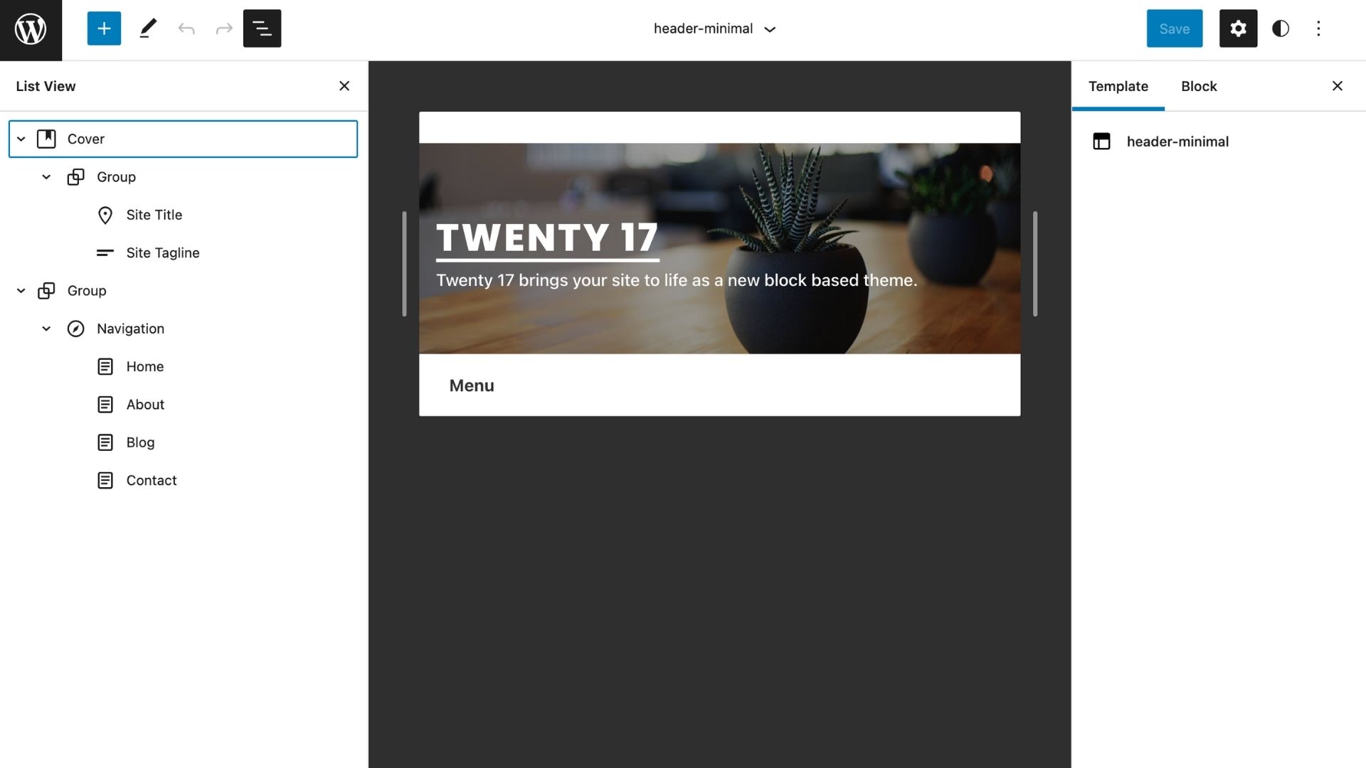
Blockbase has a great collection of templates and template parts. I only added two new ones in total and edited the rest. I started with header-minimal and worked on the interior page header design.

The header only needs two parent blocks to achieve the design. The cover block groups the site title and tagline together, and a new group block below the cover contains the menu. The group block is helpful here and in many instances in the site editor because you have more design choices with colors, padding, and margin.
The cover block is so easy to use and fits well with this template part. I just eyeballed the height by dragging the slider until it looked like the right amount of spacing above and below the site title and tagline.
This is one of the very rare instances where I added some CSS. A limitation for the group block in the Gutenberg version (12.7) at this time is you cannot unlink the border controls. I needed to add a light bottom-border to the menu block and had to rely on a bit of CSS.
The finished result for the minimal header is very close in my opinion. Following my basic rules, it is not pixel perfect. I didn’t aim for matching opacity on the cover block overlay, and the font spacing is close.

Sidebar and footer template parts
Again, waiting to tackle the homepage header, I started working on the sidebar. I love working on template parts like this in the site editor. The clean view of just the content for the template part helps focus on the design in that one contained space. While it is helpful to design around the rest of the site content, you don’t have to worry about accidentally editing other templates or your page when in the front page editor view. It’s a little distraction free and and less prone to errors.

What I like about the theme template parts so far is that the blocks and layouts are pretty simple. This is just a column with heading, text, and search blocks. Nothing too intricate. Everywhere I’m adding headings and text, I’m just manually changing the typography settings for: Appearance, line height, letter case, and letter spacing. The heading block has improved so much with the margin setting alone. Getting the spacing close was relatively easy.
Still avoiding the large header, I worked on the last core template part for the page layouts: the footer. This also consisted of fairly basic block layouts.

Homepage large header template part
After avoiding it for long enough, it was time to build the large header template. I opened the header template from the Blockbase theme and just deleted every block. Working from a clean page would help speed the process up. I copied all the content from the header-minimal template part I completed early and just pasted it in there. This saved a bunch of work because I had the two groups of blocks (cover and navigation) all designed how I wanted.
The tricky part for me was trying to match the Twenty Seventeen layout with a full view height image and header menu fixed tot he bottom of the screen. The cover block has an easy toggle to make it full height. However, that pushes my navigation group below the screen. We would lose our same look as the original theme.
After spending what seemed like forever trying to get the navigation block to align with the bottom of the screen the way I wanted and retain padding and alignment. Custom CSS, different block arrangements, I mean nothing was working. I eventually made some concessions.
I was able to get the cover block close to full height without pushing the menu below the screen and not having it sit awkwardly higher than the original theme. Instead of dragging the cover block and using the pixel dimensions, I changed the Minimum height cover settings to VH (view height) and set it manually to 85%. This gets the cover image to almost full height and leaves enough room for the navigation to be in full view, almost “fixed” to the bottom.
Twenty Seventeen’s navigation header is sticky on scroll and includes a nice smooth scrolling effect when users click the arrow icon to jump to the first section. I attempted a few things to get the header to stick. I’m not a clever enough coder, and the very easy to use (and cool) Sticky Block for Gutenberg plugin created too many design complications. That block essentially creates a new container group for any collection of blocks, but it added padding around the navigation content, undoing the nicely aligned site title elements.
One think I did add that probably isn’t useful since I’m exporting a theme package is Nick Diego’s The Icon Block plugin. I don’t know much about themes, but I don’t think I can include a plugin with it. Seems silly to add a plugin for just one icon, but it did the job and looks nice. Adding anchor links is so much easier to do now with the list view. The page just jumps instead of a smooth scroll, but I’m not going for perfect recreation. Let’s just add the icon block to core please.
I’m pretty happy with the final result. I didn’t even attempt to match the mobile menu design. You can’t in Gutenberg now anyway, and I think the default mobile menu overlay works very well with my updated block theme.

Creating the page templates
The nice thing about these default themes is that there are only a few page layouts. Now that I have the template parts created, assembling the templates is pretty easy. I only need to create templates for: Front page, default page, posts index, and single post.
Front and single page templates
This is so easy. Open the site editor for you for your page and open the block inserter or type the slash command and start typing “template” to see the Template Parts block. Since I already created my core parts, I just select the one I want for each page. The front page I add the header part and use the header-minimal part on the default page. Next, add the Post Content block and set it to Inherit default layout. Add the Footer template part and you’re done.
The front (home) page and all interior pages are ready to start designing. The Post Content block is set in the template so that your content actually appears on the site when you start building your pages.


Index (posts) and single post templates
It’s amazing how few blocks really make up these templates. When you first open the list view after inserting header and footer template parts, you might feel overwhelmed by the amount of blocks. If you collapse the template part blocks it looks much more streamlined. All I needed to do next was add the post layout with the sidebar.
The Blockbase theme already includes the Query block for all of our posts on the Index and Single Post templates, so you only need to add the sidebar and then rearrange the Post blocks and edit the settings for each block to get close to your design. I added the Column block and set it to two columns with the main column at 66.6% and the sidebar 33%. Add the Sidebar template part in the right column, then just drag the Query block into the left column. I find this so much easier to do with the improved list view.
I played around with all the block settings to get the post feed to match the original Twenty Seventeen theme, which was just a matter of tinkering with the block editor until I got the look I liked. Since we added all the posts at the beginning this process was much easier because there was actual content to work with.
That’s it. The layout is all done. In the finished Index template, all I have is: Header, Footer, Heading block, Column block, and the Query and Sidebar template nested in the columns. I did transform the columns into Group blocks, and that again is to gain some extra design control. You can set it to inherit the default layout and adjust the blog spacing between the columns.
All I had to do to edit the Single post template was copy and paste my everything from the Index template. I just replaced the Query from the multi-post Index with the Post template blocks that are already included with Blockbase.


Building the front and single pages
By now I feel like I’ve mastered the block editor. I don’t even need to worry about the template parts anymore, and they gave me enough practice with the block editor that I can breeze through building the front and single pages.
The sections on the Twenty Seventeen theme pretty much repeat themselves. Below the header is a two column layout with a heading on the left and text on the right. Below that is an image with a fixed parallax background, and then the sections repeat themselves.
I recreated the first two sections with the column blocks and cover block. Set the cover to full height and fixed background, then just duplicate the sections and change the content. The page comes together so fast with blocks.
The only change is the blog section which replaces the text with the Query block to display the most recent posts. Since I already a Query for posts in the Index template, I just have to drop that into the page with a simple copy and paste. To keep saving yourself even more time, create a template out of any block or group of blocks on any page from the vertical ellipses setting. This will only increase your page building efficiency over time as your site grows bigger.
Interior pages are even easier than the front page. Again, with the list view I can copy my column and cover blocks from the front page and just past on each of my other pages. Just swap the content.
Wait!
There is one minor improvement on the other single pages: Post Title block. Swap out the heading with the Post Title to match the page title design of Twenty Seventeen. Since the Post Title block is not on the Single Page template I created, then it will not display on the other pages. Ideally it would be included in the template, but pages would need to include the option to add an Excerpt in the page settings panel. That’s only available for posts so I can’t get the desired page layout.

Comparing Twenty 17 to Twenty Seventeen
I’m really happy with how the new theme turned out! It is not pixel perfect, but side-by-side comparisons are hard to spot the differences. What I’m really waiting for now is to be able to edit all of the typography in one place. I don’t just mean the limited site editor options but designing default styles for each heading level. I’m sure all of that and more is possible through editing the theme files, but I want to truly find the block editor tools mature enough for a non-coder like me to do.
Here are the two themes side-by-side. Drag the slider in the image block to see each theme image.


Exporting my new theme
The Create Blockbase Theme plugin is so simple. Fill in the required fields with your new theme’s information and click Create Block Theme. Can’t get any easier than that, until Gutenberg 12.8 is released with the Export Theme option directly in the block editor and eventually in WordPress core.
In seconds I got a zip file and my new theme is ready. Not really sure what to do with it now. I’ve never submitted anything to WordPress.org before. I suppose there’s no harm in giving it a try. For anyone that’s interested in Twenty 17, feel free to download it here and see how I did.
Leave a Reply